
How Can Nail Techs Use Colour Theory?
Whilst there’s no 'right or wrong' when it comes to using colour, there is a science to deciphering which colours make a better combo than others and how some colours can bring out your sparkle more than the rest.
As a nail tech, understanding colour theory can help you advise clients on colours that go well together and complement your clients skin tone. This knowledge can help you achieve a more natural-looking French and give you the tools to make bolder colour recommendations.
In this post, we delve into what colour theory is and how nail techs can use colour theory in their service.
What Is Colour Theory?
Colour theory is a set of principles and guidelines used to understand how colours interact with each other and how they can be combined to create visually appealing compositions. It encompasses concepts such as the colour wheel, colour harmony, colour value, and colour psychology.
By studying colour theory, nail techs, artists, designers, and creators can make informed decisions about colour selection, create harmonious colour schemes, and evoke specific emotions or messages through their work.
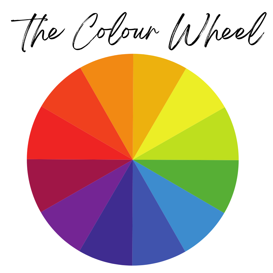
The Colour Wheel
The colour wheel is a fundamental tool for understanding colour relationships and creating harmonious colour combinations. The colour wheel was invented in 1666 by Isaac Newton, it organises the spectrum of colours into a circular format. This layout allows artists, designers, and nail technicians alike to explore how different hues interact with each other.
Complementary Colours
From the colour wheel, we can easily see complementary colours. Complementary colours are opposite one other on the wheel.
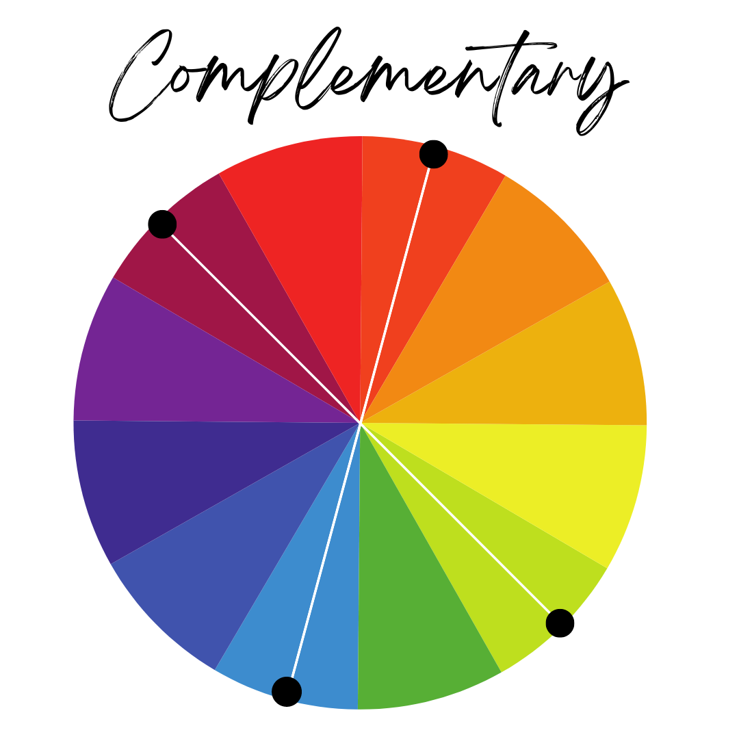
So, as you can see from the wheel, these colours complement one other:
Yellow + Purple
Blue + Orange
Red + Green
These combinations provide high contrasts and make each other appear brighter and bolder. Complementary colour combos can be used to make shapes and accents really stand out for a bold and energetic effect.
Monochromatic

When most of us think of monochrome we think of purely black and white designs but monochromatic actually refers to using one colour in varying tones. Using the same colour in various shades can provide a subtle but stunning combination. It can elevate and bring depth to a set.
Analogous

Analogous refers to three colours which are side by side on the colour wheel. This works well when you have one dominant colour and two accent colours. Colours that are next to each other on the colour wheel tend to have a lot in common and communicate a similar feeling. You often see analogous colour schemes in interior design to bring variety of colour without a strong contrast. It creates more subtle colour combinations.
For example:
Triadic
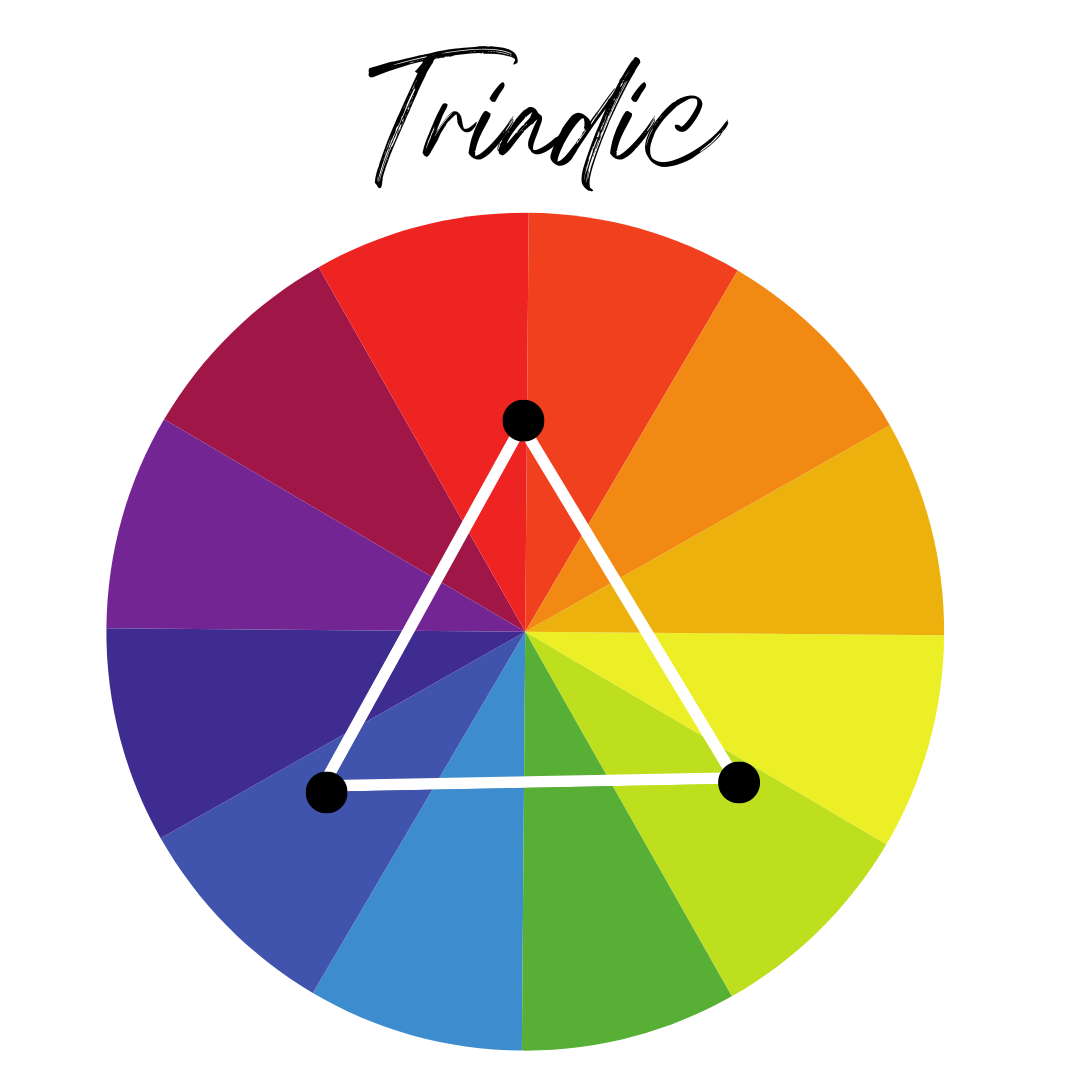
Triadic refers to three colours which are evenly spaced on the wheel. This combination provides a high-contrast colour scheme but isn’t as intense as complementary colours.
For example:
Warm, Cool and Neutral Colours
If you look at the colour wheel, you should be able to split the wheel into warm and cool colours.
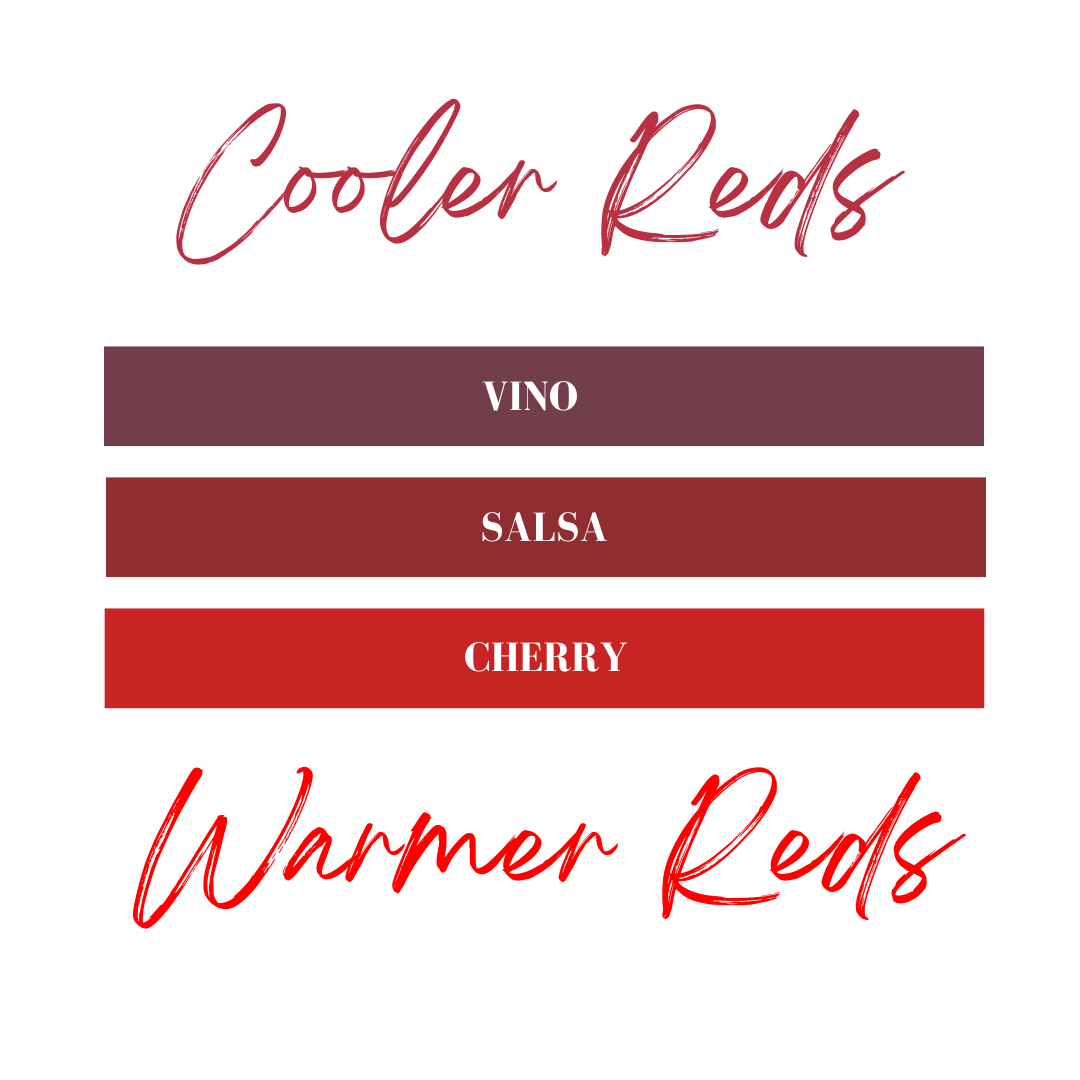
You may have heard that red, orange and yellow colours are always warm. But that isn’t necessarily true. There are warm and cool versions of all the colours. Reds are probably the easiest example to see this. Pure red is a warm colour and can be made warmer by adding yellow. But it can also be turned into a cool red by adding blue.
The simple rules to remember are these:
- Warm colours are warm because they have yellow, orange or red added to them.
- Cool colours are cool because they have blue or green added to them.
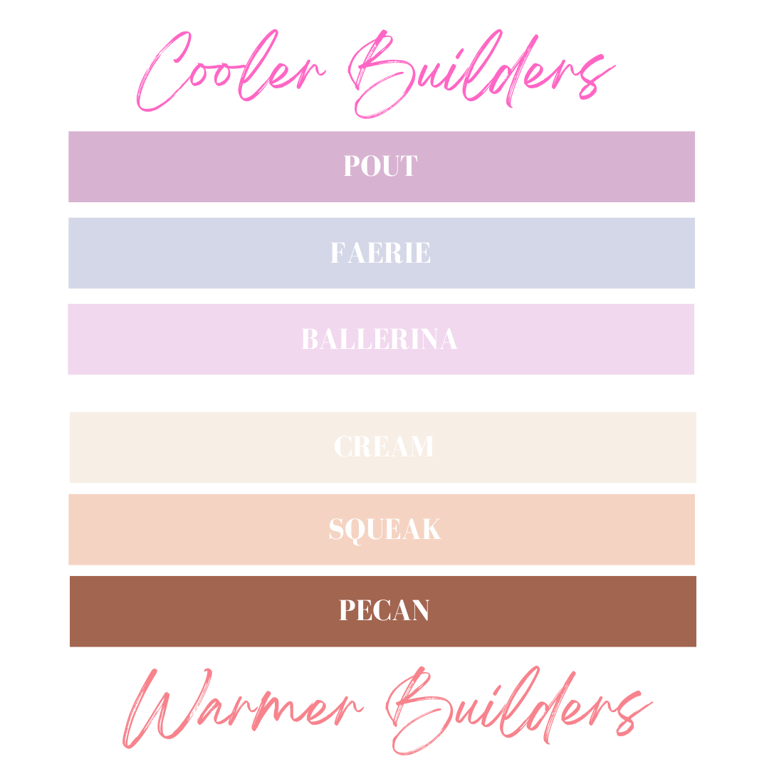
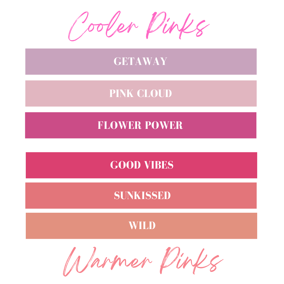
Choosing colours for skin tones
When choosing colours for skin tones we will want to look at our client's natural nails and skin and determine if they have a warm, cool or neutral undertone. There are a few ways to do this. One is to take a pure white piece of paper and place it next to their natural skin in daylight. If their skin appears more yellow next to the white, they likely have a warm undertone. If they appear more pink, they likely have a cool undertone. If it is difficult to tell they could have a neutral undertone.
You can also look at the inside of your client's wrist. If their veins appear purple and blue then it’s likely they have a cool undertone and if their veins appear green and blue they may have a warm undertone.
If you want to create a natural look, you’ll want to find a shade which is similar to your client's natural nails or has the same undertone. Alternatively, if your client would like advice on choosing a bolder colour, colours that match their colour family will suit them the best. Those with neutral skin tones are able to wear a mix of warm and cool colours.
Conclusion
In essence, colour theory isn't just about picking pretty shades—by embracing colour theory, nail techs not only enhance their service but also empower themselves to unleash their creativity and offer tailor-made recommendations that leave clients feeling confident and fabulous. So, let's paint a picture-perfect world of nail art where every shade tells a story and every client leaves with a smile!
